Despar
How do you turn a fragmented retail institution into a national treasure?

Challenge
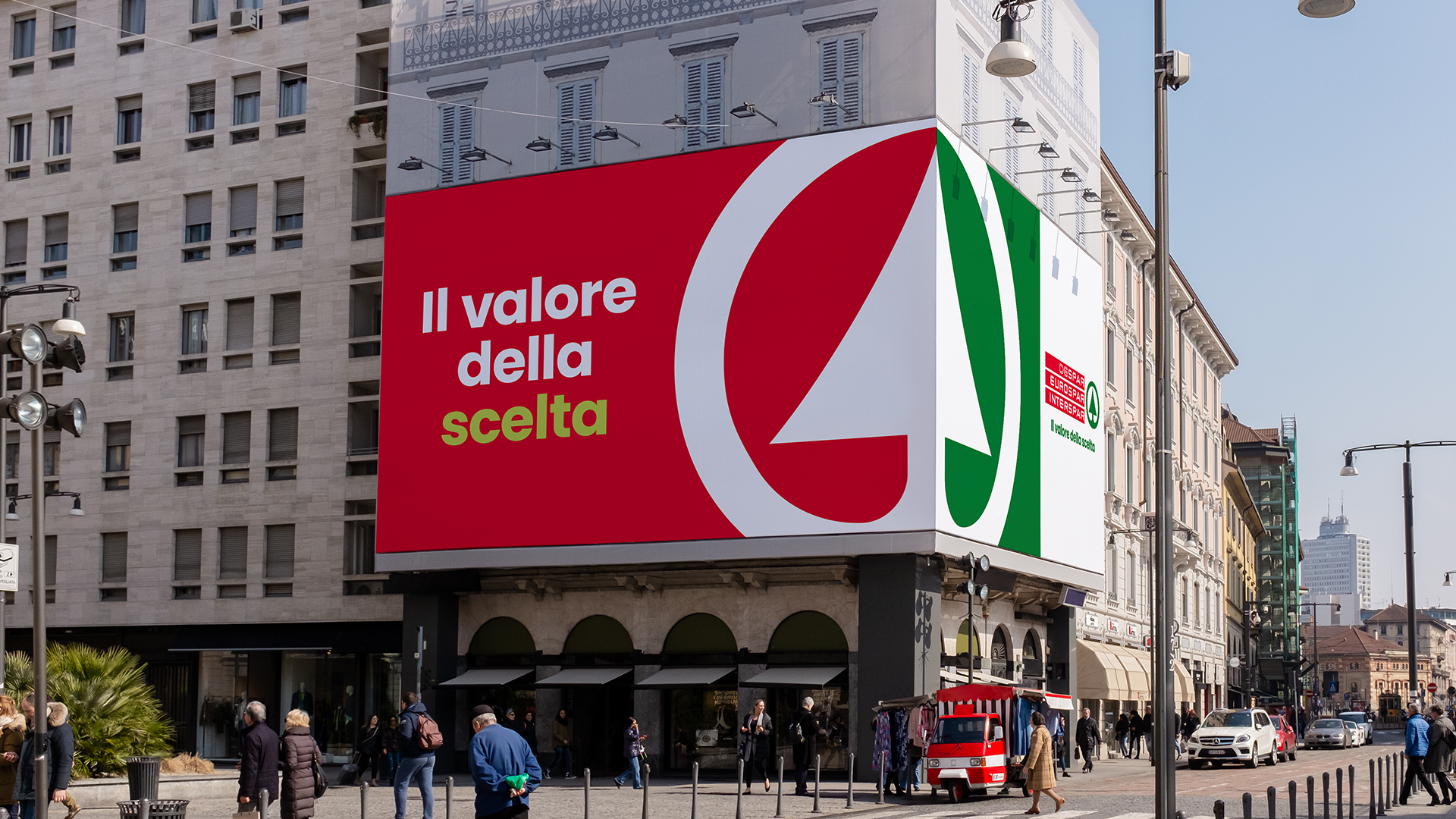
As Despar grew across Italy, complexity increased. The brand needed to unify its identity and reassert its iconic status, without losing its defining commitment to serving local communities, across multiple store formats.
Solution
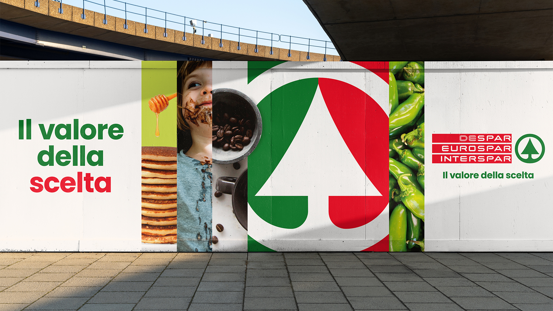
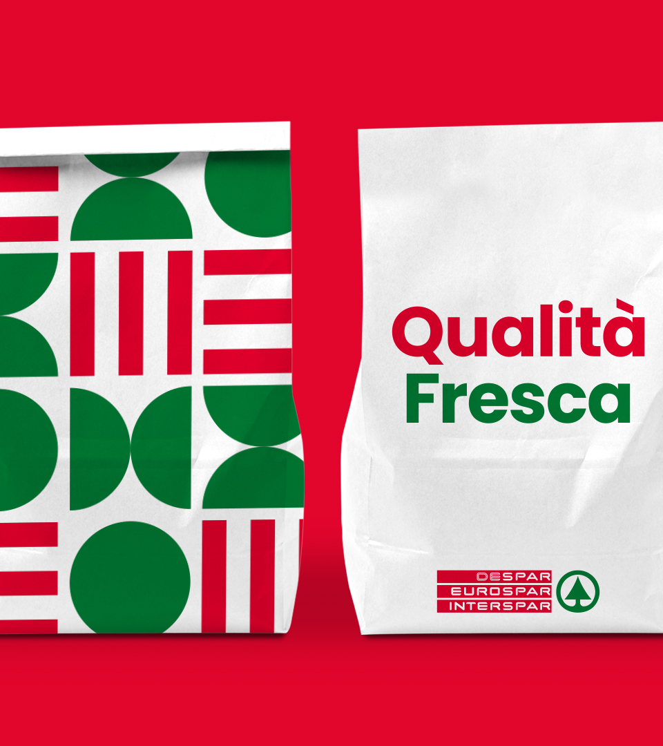
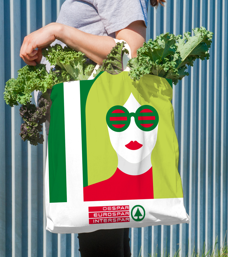
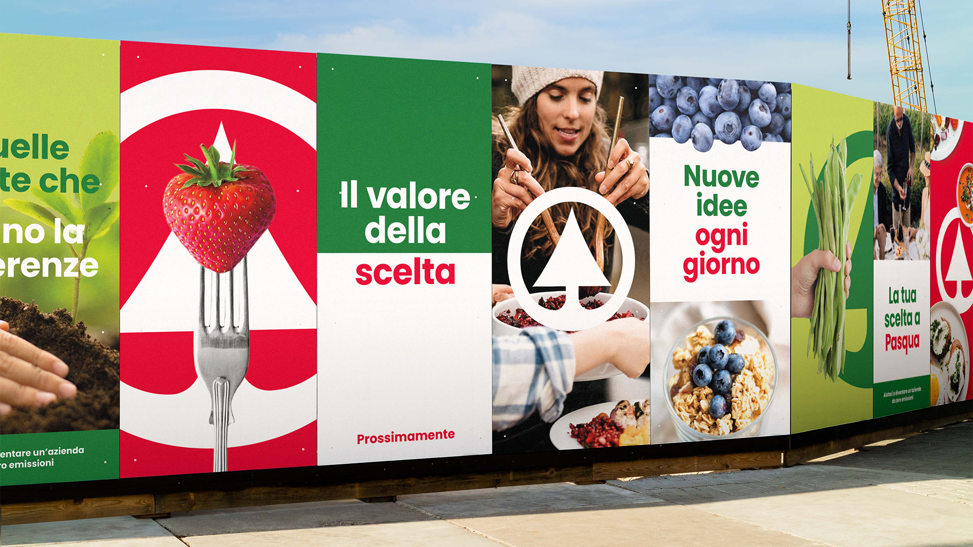
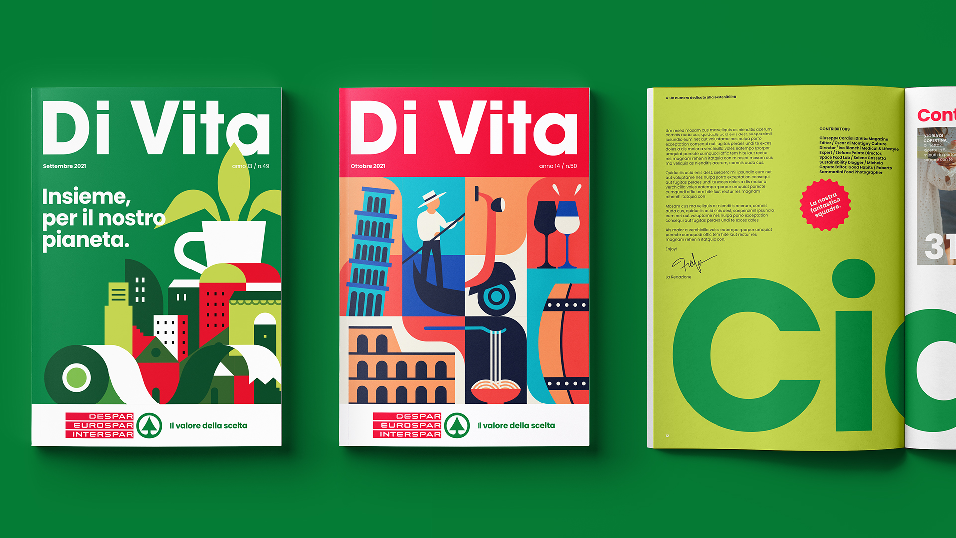
We reframed Despar from a price-led retailer to a value-added brand with a new platform: “The Value of Choice.” This became the foundation for a flexible design system that reintroduced iconic assets like the fir tree and three bars, supported by a rich verbal identity. The masterbrand story was then translated across three distinct store formats through a coherent graphic, photographic and tonal system.
Impact
Despar was re-energised as a modern national icon: more visible, relevant and easy to navigate for shoppers, and easier for internal marketing teams to deploy. Each format now plays a clear role within the brand family: Despar (local and community-led), Eurospar (fresh and family-focused), and Interspar (value, variety and destination); reinforcing Despar’s place in the fabric of Italian life.